Archive for the 'Data Visualization' Category

A new infographic – just in time for Shark Week!

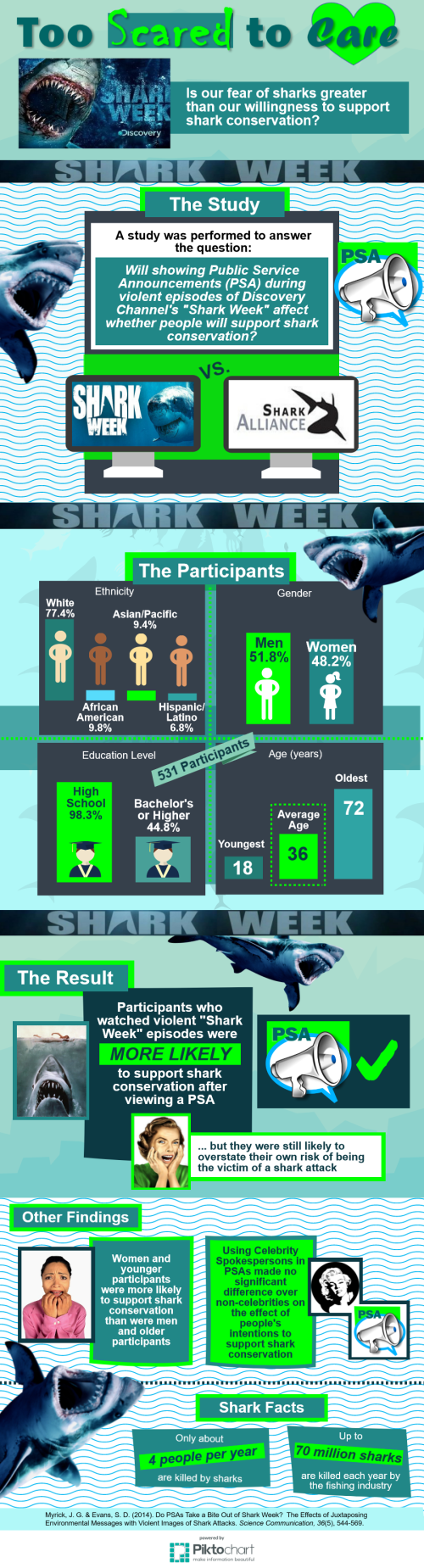
In honor of Shark Week on Discovery Channel, we wanted to share this infographic about shark-related public service announcements! Our graduate student Alice Gero created this infographic to report findings from the article “Do PSAs take the bite out of Shark Week? The effects of juxtaposing environmental messages with violent images of shark attacks.”

AGero - Shark Week Infographic

All about Space X’s Dragon Capsule

The Dragon capsule, built by the company Space X, made history by completing the first private flight to the space station and back. Over at the Atlantic, the capsule and its flight are broken down by the numbers. For the more visually minded, check out the cool infographic below:

See inside SpaceX's private Dragon space capsule and Falcon 9 rockets in this SPACE.com infographic.
Source SPACE.com: All about our solar system, outer space and exploration

Seven Ways of Looking at Document Cycling

Sam DeKay’s 2007 article “Collaborative Writing, Document Cycling, and Gatekeeping in a Fortune 500 Company: A Case Study and its Implications for Business Communication Instructors” provides a great insider look at the way documents move through an established, sophisticated corporate environment. The article introduces readers to two writers; one of these writers, Dan, develops and revises policy that receives feedback and approval from a variety of different stakeholders. DeKay’s description of Dan’s document cycling process is fascinating, but the article doesn’t provide any illustrations to accompany the description. To remedy the situation, the seven students in UAHuntsville’s Technical Editing graduate seminar produced visualizations of Dan’s document cycling process. Produced by computer and by hand, the visualizations each provide a unique representation of the process. Check out Document Cycling Illustration #1 below and click on the links for the remaining six illustrations.


Document Cycling Illustration #2

Document Cycling Illustration #3

Document Cycling Illustration #4

Document Cycling Illustration #5

Document Cycling Illustration #6

Document Cycling Illustration #7

Apollo 1 Infographic

Nasa recently released this infographic commemorating the Apollo 1 disaster. It’s an interesting example of risk rhetoric and the emotional impact that infographics can achieve:
Find out why the three Apollo 1 astronauts died in an accident on the ground, in this SPACE.com infographic.
Source: SPACE.com: All about our solar system, outer space and exploration

Designer’s Toolkit Infographic

From the blog Daily Infographic comes this cool breakdown of the apps used by design and creative professionals. The Hidden Gems section is especially helpful:

Designer's Toolkit Infographic

TED talks on the beauty of data visualization

TED Talks is a series of consistently engaging videos featuring smart people talking about smart things. In this video, journalist David McCandless argues that data sets should be considered relatively – that is, that data is only meaningful in relation to other data. Therefore, it’s the job of researchers and journalists (and technical communicators) to find and convey those data relationships which illuminate the world in interesting ways:

https://ted.com/talks/view/id/937

UPDATE: Huntsville is offering TEDxHuntsville 2011, its own version of TED talks, this Sunday, November 6, from 1-5 pm. Registration is online at the link.

Kepler Data Visualization and Data Fatigue

Earlier this year, the Cosmic Variance Blog at Discover Magazine posted this very cool visualization of planetary candidates discovered by the Kepler satellite. The image and video make these findings tangible and exciting. Months later, the blogger looks back on the visual when contemplating the overwhelming feeling of data fatigue he’s been experiencing. The post highlights one of the challenges faced by technical communicators: how to make things interesting and appealing at a time when people are drowning in information. The blogger writes: “We are being swamped by data in unprecedented forms and quantities, and it’s a crucially important task to sort it all out and understand how we can use it.” Great tech writing should help with this process of sorting out and using the nearly limitless amounts of data we have available.


Archives