How Technical Writing Classes Helped Me Finish My Ph.D.

In August 2014, I felt more or less like the narrator in Robert Frost’s “The Road Not Taken.” I stood at a crossroads facing two possible paths: one led to a doctorate and greater qualifications for a job in academia, while the other led to a business degree from UAH and a job close to home.

“And sorry I could not travel both

And be one traveler, long I stood

And looked down one as far as I could” (Frost, 2-4)

Not knowing what else to do, I enrolled in the English MA program at UAH, took business courses alongside the English ones, and began applying for Ph.D. programs – all of this until I could figure out which path was the one for me. During that academic year, one factor that weighed heavily on my decision was the Technical Writing Graduate Certificate, which I badly wanted to complete regardless of which path I chose.

To this day, one of my biggest regrets is that I didn’t have time to finish that certificate.

Technical writing offered me two advantages that year: 1) another qualification that would look good on my CV, and 2) a new skill to learn completely different from the ones I had already. The classes were a breath of fresh air: they added a new dimension to my academic life, they gave me a boost when I began working as a technical writer with a Huntsville contractor, and they made me ponder how to translate these skills back into my research focus. All of this, coupled with Dr. Weber’s infectious enthusiasm, made for a very enjoyable academic year.

By May 2015, I had decided definitely that I would begin doctoral studies at the University of Louisville that autumn. I had completed two tech writing courses, I still had a summer to work at my tech writing/editing position, and I had a plan that would keep me busy for the following four years. I was simultaneously excited and terrified, but I knew I had the skills to persevere. Just to name some of the things those two courses did for me:

  • I wrote a book review in a format acceptable for publication, which helped me later in a doctoral summer project where I wrote four book reviews on works pertaining to a preferred research topic. (Even though I didn’t publish them, I know what it takes to write them.)
  • I studied the beginnings of international communication, which came in handy when I began taking translation courses that counted toward another graduate certificate. I also compiled this information into a presentation for my first academic conference in 2015.
  • I relearned basic editing skills that I’d learned years before and forgotten, which I applied to drafts of my seminar papers and my dissertation.
  • I absorbed the basics of programs such as MadCap Flare and Adobe Captivate, which served as my introduction to the digital humanities, and (even though I used different programs) I later used the same skill set to make videos for an art history class.

It wasn’t until I was halfway through my degree that I realized just how much those tech writing courses had stuck. The skills had become second nature to me in the same way that speaking Spanish is second nature to me. It’s part of me, just as my completed dissertation is part of me.

Technical writing is something that will carry over into anything that you do. Part of being human is that we’re always learning and we must always be open to trying new things. Even though technical writers carry with them the stereotype that all they do is write task manuals, they do so much more than that. They work with a broad range of people, they write documentation for all employment such as universities, museums, and DOD companies; they incorporate their language skills; they learn the publishing market, etc. Technical writers are always in demand, and those of you working on the certificate will find jobs.

Now here I stand, September 2019, searching for jobs, and ready to apply those skills again. If I ever move back to Huntsville, then I may go back and finish that certificate. If I don’t ever get that chance, then I know that the classes I did take will stay with me into my new venture. To all of you in the English M.A. right now, I cannot recommend the certificate and those courses enough. Thank you, Dr. Weber, for aiding me in my path to my Ph.D.!

Have a wonderful school year all of you!

Erin S. O’Reilly
Graduate Student, 2014-2015
Department of English

P.S. Who wants to bet that I’ll find lots of places to improve and come back and edit this in 24 hours?


7th Annual Rocket City Technical Communication Conference March 10!

ShelbyCenter

Join STC Huntsville/North Alabama for our annual half-day technical communication conference on Saturday, March 10! This year’s theme is “The Next Horizons of Technical Communication,” and we will feature presenters from MSFC, SAIC, Media Fusion, Calibre, Curse Inc, Geeks and Nerds, and more! This event offers insightful presentations, great networking opportunities, and food!

7th Annual Rocket City Technical Communication Conference
“The Next Horizons of Technical Communication”
March 10, 2018, 9:00 am – 12:00 pm, with lunch following
Shelby Center (SST), UAH campus.
$10 for students and members, $20 for non-members.

You can email Ryan Weber at rw0019@uah.edu if you want to register early and pay in advance.

User Help: Snowboarding Game Instruction Booklet

When video games are involved, instruction manuals must live up to a high user-help standard for gamers. Intuitively, gamers might skip the manual all together and rely on their gaming experience to provide them with an understanding of how the game works. In this process, the possibility of missing vital information intended for the game becomes imminent. At the time, when I played the snowboarding game SSX 3, having not read the user manual, I did feel as if pieces of information were missed. Gamers often immerse themselves into playing the game without the aid of the user help. But with the user help, it could positively impact the gamer’s experience allowing room for an increased satisfaction for the game. Enter the instruction booklet.

The SSX 3 instruction booklet, which is shown in Figure 1.0, has proven to be a very beneficial user help as it encompasses the functionalities of the game. For an online view, the user help can be referenced here.

TE11

The booklet meets several quality criteria for good user help as it includes the following key components:

  1. User centered and clear
  2. Task based and consistent
  3. Content Aware
  4. Attractive

1. User Centered and Clear

When user help fits the user centered criteria, users can easily identify their role in the user help. They understand that the user help is to inform and help the users in general. That notion along with keeping the user help clear in content avoids confusion on the user’s part, preventing any frustrations toward the instructions. The booklet has a casual language, in a way that it interacts with the user before the game starts. This strengthens a connection with the user. On page 11, under the Scoring header, it says, “Hammer out some cool tricks and watch your score rise. The bigger the trick, the bigger the reward.” On the same page under Game Screen, it starts off as, “Most events begin with your rider at the starting gate at the top of the track. Once the gate opens, your rider automatically starts down the hill.” In these examples, the language is shown to have a casual style, in which permits the user to fully understand the content.

2. Task Based and Consistent

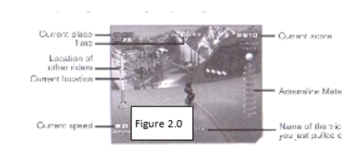
For the task-based and consistent criteria, the booklet uses these to ensure that the instructions are followed in a specific and chronological order. Certain tasks can be found in screen captures that provides a visual approach to the task-based criteria. An example of the task-based screen capture is shown in Figure 2.0 as it has gaming controls and names pointing to each section of the screen capture.

TE2

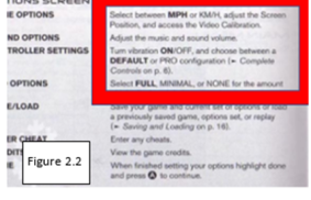
The booklet also uses a few header fonts to inform the user what type of information they’re looking at. It could be listed as a topic, sub-topic, or an instruction that also remains consistent throughout the entirety of the booklet. Through this format, users can find certain information contained in an organized form. The instructions have the important controls as well as commands bolded within the text to capture the user’s attention; this emphasizes each main point. For example, note the controls and bold font in Figures 2.1 and 2.2.

TE3TE4

3. Content Aware

For content awareness, the instructions are organized in a way that would lead the user through the its pages by level of importance. This is first seen on the table of contents page. On the table of contents, it guides the user—especially a new user who hasn’t used an Xbox yet—through the process of starting up, introducing the game, and more. In Figure 3.0, the contents are laid out like so.

TE5

The content page is also organized to help prevent the user from losing track of their place. The page has organized information directly related to the game, which is separate from other information such as “Using the Xbox Video Game System” to “Basic Controls” and “Credits” to “Limited 90-Day Warranty.” Users, such as gamers, would be eager to see that under “Shredding the Slopes” the sub header called “Tricks” is easily identifiable. That section is especially useful if users want to refer to the Tricks page when needed.

4. Attractive

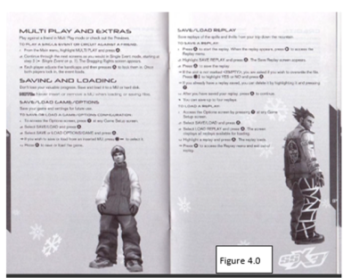
As for the attractiveness of the booklet, there seems to be an attractive quality that urges the user to continue forward in the instructions. The design of each page engages the user by its animated snowflakes and pictures of the game’s snowboarding riders. Through this technique of visual input, it helps the user gain excitement to play the game before the game starts—this is another type of ‘interaction before the game starts’ that was mentioned before in the User Centered and Clear section. The current visual design—as in the pages with pictures, screen captures, snowflakes—is more impactful as opposed to user manual that doesn’t have pictures at all. In Figure 4.0, it shows the attractive layout that the booklet contains on almost every page.

TE6

Conclusion

When I first used the instruction booklet, I found it extremely helpful for my gaming experience. There are many components of this user help that increases a user’s understanding of the game. When I took the time to read the instruction booklet, I found myself learning about the different hidden gateways of the game that I didn’t see before. This is relevant toward the main menu options, saving the game, setting up the game, level-ups, hidden passageways, etc. But overall, this instruction booklet met the criteria for good user help as it is user centered containing clear writing and is task based with a consistent format. It is also content aware of the audience and has an overall attractive quality.

Excellent User Help: Skype’s Visual, Streamlined Approach

There are a variety of web-based video chat applications that you can choose to employ for real-time internet conversations. FaceTime, Google Hangouts, AnyMeeting, TinyChat, and even Facebook have a version of video chat that users can download, buy, or stream easily. Skype, however, is one of the biggest names in this game, and their user help reflects the simple, streamlined approach this app uses to help you get the most out of their product. Skype’s use of visual instruction, simple menu help options, and minimalistic layout make it easy to troubleshoot the software and have video calls up and running in no time.

Skype’s user-centered help runs on two fronts: in-app prompts, and a web-based help database you can access through the software. I myself ran the gamut of glitches trying to re-install Skype on my own computer recently, and was impressed by the way the app handles user help. (You can find the web-based user help here: https://www.skype.com)

Criteria

The criteria in selecting the Skype app was geared towards the quality of the user experience:

  • Is the user help able to assist individuals with varied technical skill levels?
  • Is the user help effective by being clear, concise, consistent, and easy to access?
  • Does the user help anticipate problems that the user may be likely to encounter?
  • Does the user help feel personal and engaging without being overly technical or alternatively, overly informal?

With these criteria in mind, Skype demonstrates an excellent balance of combining intuitive troubleshooting options with simple instructions. The following sections will outline several potential problems that users might encounter with the software and how Skype employs good user help to provide a successful end result.

Potential Problem #1: Skype Keeps Crashing

If you have an outdated version of Skype on your device, odds are the app will crash repeatedly. I had just this problem, and Skype dutifully produced a pop-up text box in which to report issues with the software.
As my outdated Skype repeatedly flat-lined, a simple Problem Report box popped up:UHlp01

The text box presents the spaces for a name, email, and comment describing the details of the problem. The shadowed examples in each box direct you to fill in your information correctly by using examples, and the simple process is easy for users of any skill level to complete while the clear, concise layout guides the user through the reporting process seamlessly.

Potential Problem #2: Getting Stuck in the (Re)Installation Process

To my knowledge, I’ve never encountered anyone during a conversation who’s said, “You know what, I got this app that just had the best installation process I’ve ever gone through!” Skype’s installation process was one of the simplest I’ve seen, though, so perhaps there is an off-chance this may happen in the future. Skype’s latest update is designed to cross over to virtually every mobile device there is, and their download webpage makes sure you can get the right version for your device:

Uhlp02

The simple, clickable icons allow you to download whichever version of the software you need. Users of all ages and skill levels would have no trouble accessing the download, but the layout does not give a feeling of oversimplification. Once you have selected your device, there is another option to select a version for your operating system (Mac/PC/Linux) if the download page you opened does not match your OS automatically:

Uhlp03

This is another example of the visually-driven nature of Skype’s user help—wherever possible, Skype tries to show not tell. You will avoid much of the frustration that usually happens when an installation process requires you to read instructions and then switch back to completing the installation process.

After downloading the file, a visual instruction “quick guide” page opens with instructions on how to finish the download. This instruction set maximizes the efficiency of the installation process by maintaining a simple, consistent instruction style. Again, users of any skill level can easily follow the instructions and the clear, concise layout lacks any visual clutter that would distract you from the installation process. Icons show what the process should look like, while short instructions direct you how to complete it:

Uhlp04

In this case, the visual instructions are to be followed literally. All you need to do when the download is complete is drag the Skype icon into the Application folder as shown in the instructions. (I massively overcomplicated the process by not realizing you could literally drag and drop as shown below.)

Uhlp05

Potential Problem #3: How do I Log In?

Forgetting your login and password is very easy, and Skype’s process for resetting a user password is like many other websites and apps you may encounter. The Skype password recovery goes a step beyond, however, and has three “forgot my password” scenarios since forgetting your password may not be the only reason you might not be able to log in. Once you select your problem, an email on record is presented, a login code is sent to that address, and you then input the code to log in to your account.

Uhlp06

The user help for password recovery demonstrates the ability to anticipate problems: you are not limited to just one issue and Skype even incorporates the added safety feature of reporting that you think someone has hacked into your account. The help options do not assume your only problem would be forgetting your password, instead proactively anticipating more issues. Once you select a recovery option, you are also presented with an “I don’t have any of these [email addresses],” which allows you to continue working the login problem instead of dead-ending at this point if your on-file email address is incorrect.

Potential Problem #4: Where is the In-App Help?

The user help for this section is simple and efficient. Clicking on the “Help” button opens a pulldown of options you can choose from inside the app. This also highlights Skype’s ability to offer support for a variety of skill levels: if you want a simple “About” tutorial, there is one to read. If you’d rather go to an online support community and find your answer that way, you can. If you want to find support from the Skype webpage, that’s an option too. The specific help topics that Skype provides highlight the most likely things you would need help with:

Uhlp07

Windows in-app help is similar to the Mac help window and offers step-by-step instructions on what each feature of the app does. This form of user help continues to demonstrate Skype’s proactive anticipation of potential issues users may have—even if it is simply for general orientation and not a specific software issue.

Conclusion: Help that Covers Your Problems

Skype’s user help options demonstrate a proactive, user-centered focus. The simplicity of its design, dedication to anticipating your needs, and in-depth resources make for a pleasant experience troubleshooting any glitches with this widely used app. Bottom line? If you need help, you can count on Skype to pull through!

Google Chrome’s Help Center

Introduction

Google Chrome is one of the premier tools of the internet, with many jobs relying on its usability. It is currently the number one search on Internet Explorer and is used by millions every day due to its simplistic design and effective browsing. However, one of the most overlooked qualities of Google Chrome is its ability to help users utilize the application without ever leaving web browser. Since there are hundreds of functions to utilize in Chrome, it’s important to have user help that guides the user in a swift and effective way; this means the user is able to get help and quickly return to the previous task. The Help achieves this through its design, usability, and style.

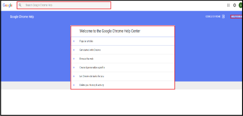
The Help Center opens to its own fully integrated web page, where it greets users with popular problems in a quick-search catalogue format; and it has a search bar where users can type in problems beyond the common or simple ones found in the catalogue. The page has a link to a help forum, where users discuss different solutions to known problems and answers to new problems, as well as video links to educate Chrome users, ranging from novice to expert. The Help Center covers most problems a user might come across and has a solution for them, making it extremely effective. The only negative for Chrome’s Help Center is the difficulty in finding it the first time. Obviously the user could search for it on the internet, but finding it naturally is not intuitive.

User Help 1

Figure 1

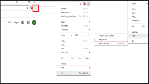
As Figure 1 shows, the user must first find the menu, then find the “Help” tab in the drop down options. Once the user places the cursor over “Help”, they will click “Help center”. Even though it is only a three step process, finding the Help Center could be difficult for first time users without previous experience.

Design

What good is user help unless it actually helps the user? Google Chrome’s Help Center is designed to answer the majority of problems with the user put first and foremost, giving an experience that is user-centered and task-based.

User-Centered

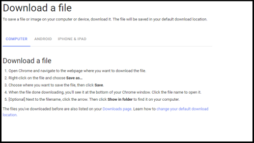
User-centered is how well the help meets users’ needs. This is best done by going through one significant step at a time. One example of how Chrome’s Help Center is user-centered is its instructions on how to “Download a file”.

User Help 2.1

Figure 2


The instructions are presented in a manageable size that produce meaningful results with each step. This is essential to meeting a user’s needs as it solves problems fast and keeps time spent in the help to a minimum. In Figure 2, the help tells the user where to begin, how to accomplish a task, what to do after the task is complete, gives an extra step just in case the user may have needed it, and provides helpful links. This is everything user-centered help needs to be and Chrome’s Help Center replicates this style throughout all help pages.

Task-Based

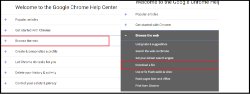
Task-based help is how well the help stays on a particular task, how easy it is for the user to access the needed help, and that the help focuses on what the user can do rather than features of the system. From the “Download a file” example, it’s easy to see that the help stays on its task through every step without giving the user extra information. Finding the help is just as important and Chrome does a great job of making sure the help is readily available. The Help Center only presents topics that lead to specific user help instead of presenting the user with all of the help available. The Help Center further breaks the topics up into categories instead of listing every topic and having the user visually search through them. Figure 3 contains the two steps needed to find the “Download a file” help.

User Help 3.1

Figure 3

If the user is unaware of where to look for a particular topic, the Google Chrome Help search bar is always available. And searching for a topic is easy as seen in Figure 4.

User Help 4.1

Figure 4

The user only has to begin typing in a topic where help is needed, and Google will give suggestions to fill in the rest. Once the user clicks on the help needed, Help Center directs to a page with that topic only. The Help Center is incredibly task-based thanks to its focus on one task at a time and the accessibility it presents in finding specific topics.

Usability

The Help enables users to find desired help quickly and efficiently by being easy to browse and use.

Easy to Browse

As stated earlier, the Help Center provides the user with useful and popular categories up front. When the problem isn’t available in the categories, the user can search and find any problem they may have. And if the problem isn’t found by the search bar, the Help Center provides a help forum where the issue can be discussed and hopefully resolved.

User Help 5

Figure 5

Easy to Use

Once the user finds the needed help, it is incredibly easy to use. All of the help provides step by step instruction for each problem, and it never gives unnecessary or useless steps. An unnecessary step can be considered anything that does not get the user closer to finding a resolution to the problem. Each step is numbered and each number has the user doing a significant task before moving onto the next one. The help sometimes provides extra or optional steps for the user to take their tasks further, as seen in Figure 5, but these are noted as optional.

User Help 6

Figure 6

Style

The Help is an example of an effective writing style. It always ends with the problem resolved, is clear and concise, and uses visual aids when necessary.

Definitive End Result

Each help page is designed to solve a specific problem, and all help ends with the task completed. None of the pages leave a problem unresolved and the help always gives an idea of what to do next once the task is completed; for example, showing the user where to find a file they downloaded.

User Help 7

Figure 7

Concise and Consistent

The help is concise by always being direct and not containing any unnecessary words or steps. It is consistent by keeping all stylistic choices the same throughout all help pages. For example, bolded words are buttons that the user will click, so at first glance it is easy to know what to look for when solving a problem. Furthermore, the help always puts menu navigation in quotations so the user knows where to look but to not take action. Examples of concise steps and style choices can be seen in Figure 8.

User Help 8

Figure 8

Screenshots and Videos

The user help has links to videos that explain the basics of Chrome. Each help page has a link to a video in case the user needs a video guide; however, the videos are not embedded and the links can be easy to miss, as shown in Figure 9. The links send the user to a massive catalogue of video tutorials instead of their specific problem, but at least a video guide is available. There are no screenshots of steps, but the language is precise enough that screenshots aren’t necessary and would most likely get in the way.

User Help 9

Figure 9

Conclusion

If there is a problem on Google Chrome, the Help Center will most likely provide the solution. Through its hundreds of help pages, tutorial videos, and forum, there will be an answer to the majority of issues that may arise. Each help page uses concise and consistent language that is clear for the user and guides them effectively through a solution’s steps. The help puts the user first and is always working towards staying on and completing tasks, ensuring the user won’t spend more time than necessary getting the help they need. As far as user help goes, Chrome’s Help Center does everything with the user in mind and should be the golden standard for all help guides that follow.


An Old Manual for a New World

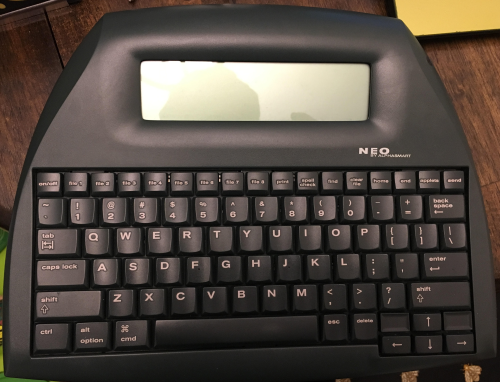
The AlphaSmart Neo is a discontinued brand of word processors that were used primarily as tools to teach typing and to administer Accelerated Reader tests in schools. However, due to their low after-market price and lack of capabilities beyond writing, they have become popular with writers looking to limit the constant distraction of the internet. Also, they are as indestructible as an old Nokia and the batteries last forever.

But even with the simplistic interface, you can still do a lot with them. Because of this, AlphaSmart gave original purchasers three forms of user help:

  • the AlphaWord Quick Guide, a list of quick shortcuts and necessary tasks adhered to the bottom of the device for quick access;
  • the AlphaSmart Neo Quick Guide, which went into more detail than the AlphaWord Quick Guide but left out more advanced tasks; and
  • the AlphaSmart Neo 2 User Manual, a nearly 300 page user manual that listed every possible function of the AlphaSmart Neo 2.

I chose to discuss the Neo 2 User Manual because it has been the most helpful to me as a frequent user. I own the Neo 1, but the differences between the Neo 1 and 2 are the size of the hard drive and color of the device, so the information in the manual works for both. The manual is easy to use because it is geared towards the user, it is task-based, it is formatted to make it easy to use, and it provides good diagrams and useful tables.

  • A copy of the manual can be found here.
  • More info on the AlphaSmart Neo can be found here.

The following sections will help illustrate what makes the AlphaSmart Neo 2 User Manual an example of great user help.

Useful terms before we get started                                                                         

  •  Applet: an application with limited functions.
  • Ordered Information: Information presented in a step-by-step format. Example: numbered list
  • Task-based Instructions: instructions designed with specific user-centered tasks rather than functional details.
  • Unordered Information: information presented in a list that does not have to be presented in a specific order. Example: bullet-point list
  • User-Centered Design: a product designed from the perspective of the user.
Figure 1.png

Figure 1. AlphaSmart Neo

Table of contents is accessible

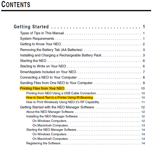
The table uses concise informational and task-based headings (see Figure 2) that easily direct the user to the information she needs. The subheadings are indented and displayed in a smaller font. This makes it easier to differentiate between broader or more frequently referenced topics like “Printing Files from Your Neo” and between specific tasks like “How to Send Text to a Printer Using IR Beaming.”

Figure 2.png

Figure 2. Table of Contents Page Uses Consistent, Task-Based Headings

Titles are consistent

Another thing that makes this manual so helpful is that the titles are consistent. The structure remains the same no matter what, and this allows the user to always know where she is within the document and how to get where she needs to be. The titles are also precise and concise, which eliminates ambiguity and unnecessary text respectively.

Headings are task-based

Other than the necessary headings like “System Requirements” and “Types of Tips from This Manual,” all of the headings are task-based. With task-based headings, the user can find the task she is trying to perform rather than trying to find the buried technical detail needed to perform the task. This helps alleviate hours of wasted time searching for that one specific function in a boring haystack of technical jargon. Users are more likely to use a manual if they can quickly find what they are looking for, which eliminates many customer service issues. This is an example of user-centered design, or design that is made from the perspective of the user.

Diagrams are easy to understand

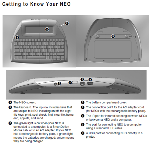
The diagrams clearly label the different parts of the device with letter labels and an easy to understand key. The picture itself is clear and of good quality, which prevents ambiguity. But what separates this user help from mediocre user help is that it also explains the functions of the parts of the machine. An example of this is label G in Figure 3: “The port for connecting NEO to a computer using a standard USB cable.” Lesser user help might simply label it a USB port.

Figure 3.png

Figure 3. Example of Diagram

Ordered and unordered information is differentiated

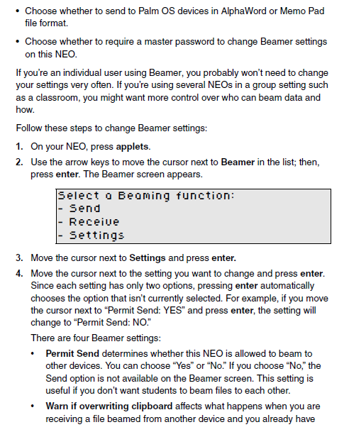
A lack of distinction between what kind of information should be ordered (a numbered list) and what kind of information should be unordered (a bullet-point list) is a sign of bad user help. Writers sometimes include information that is not necessary for the completion of a task within an ordered list. This can confuse the user because she cannot easily find the information that best applies to her situation. The ordered and unordered information in Figure 4 is carefully differentiated.

Figure 4.png

Figure 4. Ordered and Unordered Information

Tables are used when necessary

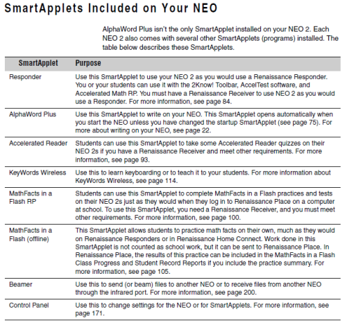
Tables are helpful when you have a lot of information that can easily be categorized under the same criteria. Rather than having several sections of similar information for different topics, you have one centralized section that the user can refer to. Figure 5 lists all of the “SmartApplets” and tells what they can do.

Figure 5.png

Figure 5. Example of a Table

Notes and additional info are separated from the main text

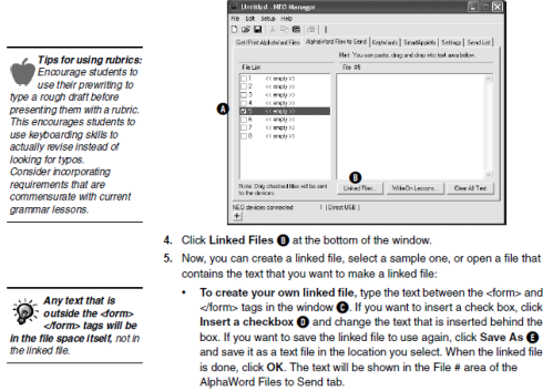
One way AlphaSmart separates notes from the main text is by the use of side notes that are demarcated with either a light bulb or an apple. The sections with a light bulb are software tips. The sections with an apple are teacher tips. This is a great example of AlphaSmart gearing the user help to their primary audiences for this text—teachers and serious users. This nearly 300 page user manual is made for the user who needs to know the intricacies of what the device can do, either because of a professional need or because she uses it so much she wants to customize the device to her needs. See Figure 6 for an example.

Figure 6.png

Figure 6. Example of Teacher and Software Notes

Information is presented in easy to read “chunks”

AlphaSmart presents information in useful “chunks” of text, tables, ordered and unordered lists, diagrams, and “see page” sections. This makes information easy to find and use, and it cuts down on the intimidation factor of having huge blocks of text.

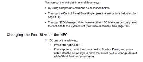
Compare the unordered information in Figure 6, step 5 to the unordered information all throughout Figure 7. The example in Figure 6 is difficult to read, and should be either broken up into another ordered list, or it should be its own topic. Figure 7, on the other hand, is easy to follow, can be skimmed, and is approachable.

Redundant information is also carefully managed in Figure 7. The manual tells you exactly what will be listed on the “see page” section, but leaves the more technical details to the referenced page. This helps reduce unnecessary chunks of text, which makes the manual easier to read.

Figure 7.png

Figure 7. Example of chunked info, redundant information, and bolding of keys.

Bolding of specific keys helps the user perform tasks

Bolding keys makes performing a task as easy as possible. The user can cut through unneeded text while in the middle of a task. When keys are bolded, the user can quickly find what key she needs to press rather than having to read over an entire step while trying to complete a task. Figure 7 is a good example of the use of bolding keys.

A good user manual makes the product more useful for years to come

If a device as seemingly easy to use as a word processor can necessitate a nearly 300 page, well written and formatted user manual, then it is even more necessary for technologies with complex software capabilities. This manual provides a good entry point into what good user help is—it is geared towards the user, it is task-based, it is formatted to make it easy to use, and it provides good diagrams and useful tables.

By providing the user with an easy-to-use manual, you can cut down on customer service complaints, bad word-of-mouth, and you will make it more likely for the user to buy your product in the future. Or, in the case of AlphaSmart, you will make it easy for a user to use your product years after it goes out of production.

Dylan Schrader is a graduate student in the MA in Professional Communication program at the University of Alabama in Huntsville, where he also works as a grant researcher in the Office for Proposal Development.

Well-designed user help takes consumer from concerned to confident

There are a variety of reasons for purchasing a new printer, but a likely one is that your old one has just kicked the bucket, leaving you in a jam with a project awaiting completion. This, of course, means you might be a bit agitated as you head out in search of a replacement.

Before leaving, you might read reviews of printer models online. That does not help your mood as people write mostly about problems and disappointments. But, with an idea of the features you want, some brand names, a price range, and low expectations, you venture off to a retailer and make a selection. After you bring the machine home, the goal is to get back in business independently, with no problems, and complete your project.

A couple of years ago, this was my situation, and I purchased a Canon Pixma MX452 All-In-One (printer-copier-fax machine). Now, I am far from tech-savvy, and I was worried because the online reviews were less than stellar. However, it turns out that setup was a breeze. (So much so that recently I bought another Canon printer for my college-bound son.) Within 30 minutes — and with what seemed like little effort on my part — the printer was “talking” to the desktop computer, the iPads, and the kids’ school laptops. Wow, did my mood — and confidence level — change for the better.

Where to Start

The key to my satisfaction was the Canon “Getting Started” guide. This document describes the steps needed to physically set up the printer, start the control panel, and get it communicating with computers through a wireless connection. Find the document online here: http://www.manualsprinter.com/manuals/canon/Canon_PIXMA_MX452.pdf

The guide is effective because it uses an obvious title, detailed illustrations, just enough language, well-ordered steps, and a commonsense layout.

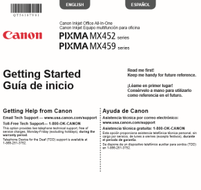
Starting with the title, “Getting Started” seems adequate to indicate this is the first guide to read, and to ensure consumers don’t launch into one of the other three pamphlets that come in the box. The guide also says “Read me first!” at the top, and it has the e-mail address and the toll-free number for tech support as the first paragraph. That is a convenient place so you don’t waste time looking all over the guide trying to remember where you saw that information. Figure 1 below shows the features I describe here.

UH1

Figure 1: The cover of the guide makes clear where to start and where to get technical help.

Well-described illustrations

The guide is clear and simple, with few colors but detailed illustrations. Most importantly, there is enough wording to adequately describe the action in the illustrations. Sometimes, in an attempt to be multilingual, user guides rely too heavily on illustrations and do not have verbiage to clarify the actions (reference some kids’ meal toys, which, made for a worldwide audience, do not include words in the assembly instructions). This guide has just enough wording.

Steps and substeps are clearly numbered, with one sentence for each step. In each black-and-white illustration, the part of the printer that is being addressed is emphasized in gray. In cases where a detail is small, there are zoomed in boxes showing what cannot be seen, down to the shape of a plug. See Figure 2 below.

usehelp2

Figure 2: Zoom-in boxes show hidden details

The guide is readable and not cumbersome, partially thanks to the fact it is printed in just two languages, English and Spanish. When multiple languages are accommodated, the type size tends to get very small and the paper gets quite large, like a car map that you can never fold correctly again.

Makes no assumptions

The layout has an orderly flow, so you can tell where to start and where to look next. In addition, the guide does not presume that a user has set up a printer before or that a user might understand a direction because he or she has done it in the past. Every step is explained with illustrations and words, including tips that are highlighted in pink.

Tips might try to prevent you from doing something you might assume is the next step. For example, Step 1.5 says, “Connect the power cord.” Then it says, “Do not connect the USB cable yet.” Or they might give more detail about what you see. For example, Step 1.7 says, “Select your language then press the OK button.” Then it says, “To change the language setting, press the Back button.”

Once the actions in this guide are complete, the final step instructs you to insert the CDROM into the computer and follow the onscreen directions to complete set-up. Installing the software takes just a few minutes and you are back in business. (For computers or laptops that don’t have a CD player, you go online to complete set-up.)

This Canon Getting Started Guide certainly can be a role model for other guides. It keeps the home user in mind, with simple sentences that adequately describe the action in the illustrations. The physical size of the guide is manageable and not convoluted by too many languages, and the layout progression is clear. This guide made me a happy, confident consumer.

By Deborah Bennick, EH-501, Oct. 15, 2017

A new infographic – just in time for Shark Week!

In honor of Shark Week on Discovery Channel, we wanted to share this infographic about shark-related public service announcements! Our graduate student Alice Gero created this infographic to report findings from the article “Do PSAs take the bite out of Shark Week? The effects of juxtaposing environmental messages with violent images of shark attacks.”

AGero - Shark Week Infographic

Columbia State is Looking for MANY Adjuncts for the Fall 2017

Columbia State is looking for some, well ok,  A LOT of adjunct English instructors for the Fall in 2017. The courses are in Columbia state’s five campuses. We host classes in Clifton, TN, Lewisburg TN, Lawrenceburg , TN, Franklin, Tn and Columbia.
PT Faculty can teach up to 3 Classes and we would make every effort to try to schedule people so they could get the maximum amount of courses per trip. Up to $4500 for a total of 3 courses.

There is a TINY travel stipend (about $100 for the semester for people driving 100 miles a week for the school).  There are over 30 sections unstaffed courses include ENGL1010 Composition; ENGL 2130 Survey of American Literature; ENGL0802 Learning Support Writing; ENGL 2015 Introduction to Film Studies; ENGL 2310 Survey of World Literature I.

Contact  Stu Lenig, Coordinator in humanities 931-540-2877Slenig@columbiastate.edu directed to inquire.

Download our free ebook!

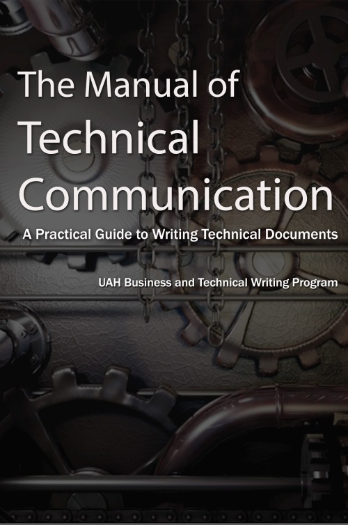
We’re offering a free ebook – The Manual of Technical Communication: A Practical Guide to Writing Documents! Anyone can download the book for free from Smashwords!

manualoftechcommunicationThe Manual of Technical Communication introduces readers to the basic principles of technical writing and offers strategies for writing several common documents. The chapters provide quick, useful descriptions of proposals, white papers, news releases, software documentation, procedures, user manuals, prescription drug inserts, flyers, resumes and cover letters, and memos. Technical professionals and technical communicators will find practical advice for writing these important documents. This book was produced by students in the Business and Technical Writing Program at the University of Alabama in Huntsville.


Archives